Your clothing store’s website is your digital storefront—it shapes first impressions, builds trust, and drives sales. A well-designed site combines aesthetic appeal, easy navigation, and smooth functionality to give customers the best shopping experience. Whether you’re building on Shopify, WooCommerce, Wix, or another platform, here’s how to design an effective clothing store website.
1. Understand Your Audience and Brand
Before you design anything, define:
- Who are your customers? (Age, style preferences, budget)
- What’s your brand vibe? (Trendy streetwear? Minimalist luxury? Eco-friendly lifestyle?)
- How do you want customers to feel? (Inspired, confident, exclusive, etc.)
Your website’s look should reflect your brand identity. For example:
- A streetwear brand might use bold fonts, vibrant images, and edgy visuals.
- A luxury boutique would use minimal design, elegant fonts, and lots of white space.
2. Choose the Right Platform
Pick a platform that balances design flexibility and business needs:
- Shopify – great for eCommerce with built-in themes, payments, and inventory management.
- WooCommerce (WordPress) – customizable, good for content + shop combo, but needs hosting setup.
- Wix / Squarespace – user-friendly drag-and-drop builders, ideal for small boutiques starting out.
3. Create a Clean and Intuitive Layout
Your design should be visually appealing and easy to navigate:
- Homepage – Showcase your best-selling collections, promotions, or new arrivals with large, high-quality images.
- Menu Navigation – Keep it simple: “Men | Women | Kids | Sale” instead of cluttered options.
- Search Bar – Make it prominent; fashion shoppers often search by product type (“black dress,” “hoodie”).
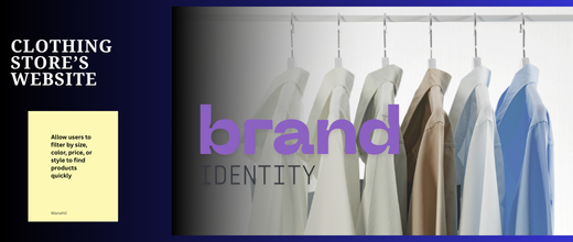
- Categories & Filters – Allow users to filter by size, color, price, or style to find products quickly.
💡 Tip: Follow the “three-click rule”—shoppers should find any product within three clicks.
4. Use High-Quality Visuals
Fashion sells through visuals, so invest in strong photography:
- Product Images – Use multiple angles, zoom, and lifestyle shots (models wearing the clothes).
- Consistent Style – Keep lighting, background, and editing uniform.
- Videos – Short runway-style clips or try-on videos boost conversions.
5. Highlight Your Brand Story
Clothing is emotional—shoppers buy into your brand identity, not just fabric:
- Create an About Us page that tells your story (why you started, your values).
- Show behind-the-scenes content (e.g., sustainable sourcing, local production).
- Use lifestyle imagery to connect with customers’ aspirations.
6. Optimize the Shopping Experience
Make buying effortless:
- Clear Call-to-Actions (CTAs): Buttons like “Shop Now” or “Add to Cart” should be bold and visible.
- Size Guides: Prevent returns by offering detailed sizing charts.
- Wishlist Feature: Let users save favorites.
- Easy Checkout: Fewer steps = higher sales. Offer guest checkout + multiple payment options (credit card, PayPal, Apple Pay).
7. Mobile-First Design
Over 70% of fashion shopping happens on mobile devices. Ensure:
- Responsive design (looks great on all screen sizes).
- Large buttons for tapping.
- Fast loading speed (compress images, avoid heavy animations).
8. Add Social Proof
Build trust with:
- Customer Reviews and star ratings on product pages.
- User-Generated Content – Encourage customers to share photos wearing your clothes and feature them.
- Press Mentions / Influencer Collabs on your homepage.
9. Integrate Marketing Features
- Email Capture: Offer a discount pop-up (“10% off your first order”) for new subscribers.
- Social Media Links: Add icons for Instagram, TikTok, or Pinterest (fashion thrives visually).
- Blog / Lookbook: Post styling tips, seasonal guides, or trend roundups for SEO and engagement.
10. Test, Analyze, and Improve
Once launched:
- Use Google Analytics or built-in dashboard to track visitor behavior.
- Run A/B tests (e.g., test two homepage banners to see which gets more clicks).
- Gather feedback from real users—what confuses them? Where do they drop off?
✅ Pro Tip: Think of your website like a boutique. The homepage is your window display, the product page is the fitting room, and checkout is the cash counter. Keep it inviting, clear, and seamless.